Yes, CANCER DEATH RATES have been on the decline since 1999. Many of us have been believing the opposite. I’ve heard it many times myself, “More and more people are getting cancer!” “There must be something in our water!”
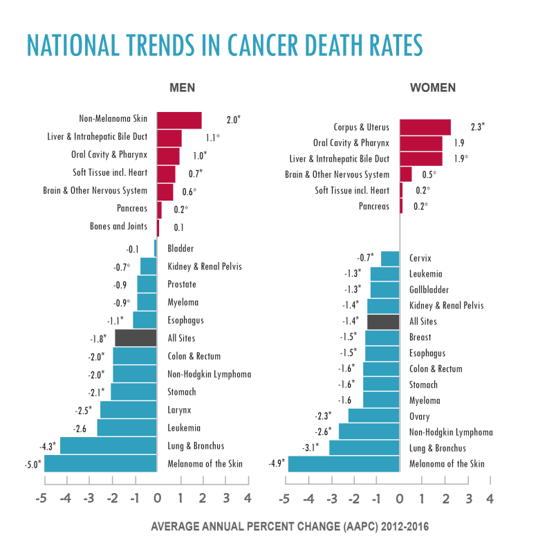
The National Cancer Institute has been tracking cancer statistics for our country for decades. The two stats that most people care about are cancer incidence and cancer deaths. Cancer incidence is the number of new cases each year. Cancer deaths is self-explanatory (the number of deaths from cancer each year). Both of these figures have been declining overall. It’s true that if you look closely and break things down, certains cancer types are occuring slightly more frequently, but more are becoming less frequent. Below is a figure showing the breakdown. It is important to note that this figure comes from recent years (2012-2016), which makes the trend more relevant to today. The blue color denotes cancer types that have declining death rates. The size of the bar corresponds to the size of the decline. The brick red bars represent the cancer types that have been on the rise. Repeat, the size of the bar does not represent the number of people with that type of cancer; the size of the bar corresponds to how much the death rate from that cancer type has changed from the prior year. As you can see, overall, cancer deaths are going down. The glass isn’t always half empty.
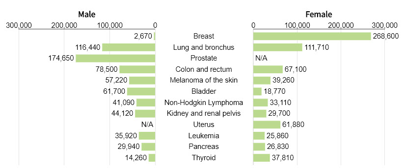
The figure below shows the types of cancer and how common they are. These numbers are estimates for 2019.
Click here to read more from National Cancer Institute’s webiste.

One Reply to ““Extra, Extra, read all about it!””